Category: 60-Second History

  • What Were the Original Campbell’s Soup Can Colors?! 🍲

    What were the original colors for the Campbell’s soup can label?

    In 1869, fruit merchant Joseph A. Campbell teamed up with Abraham Anderson, an icebox manufacturer, to create a canned food company.

    They originally produced a wide variety of items including canned tomatoes, veggies, jellies, soups, condiments, and minced meats.

    Anderson, who was a tinsmith, suggested that the original cans be made from tin.

    In 1876, Anderson left the partnership, and the company became the “Joseph A. Campbell Preserve Company.”

    Even though Anderson left, his son stayed at the company and worked as the creative director, designing the original Campbell’s Soup Cans.

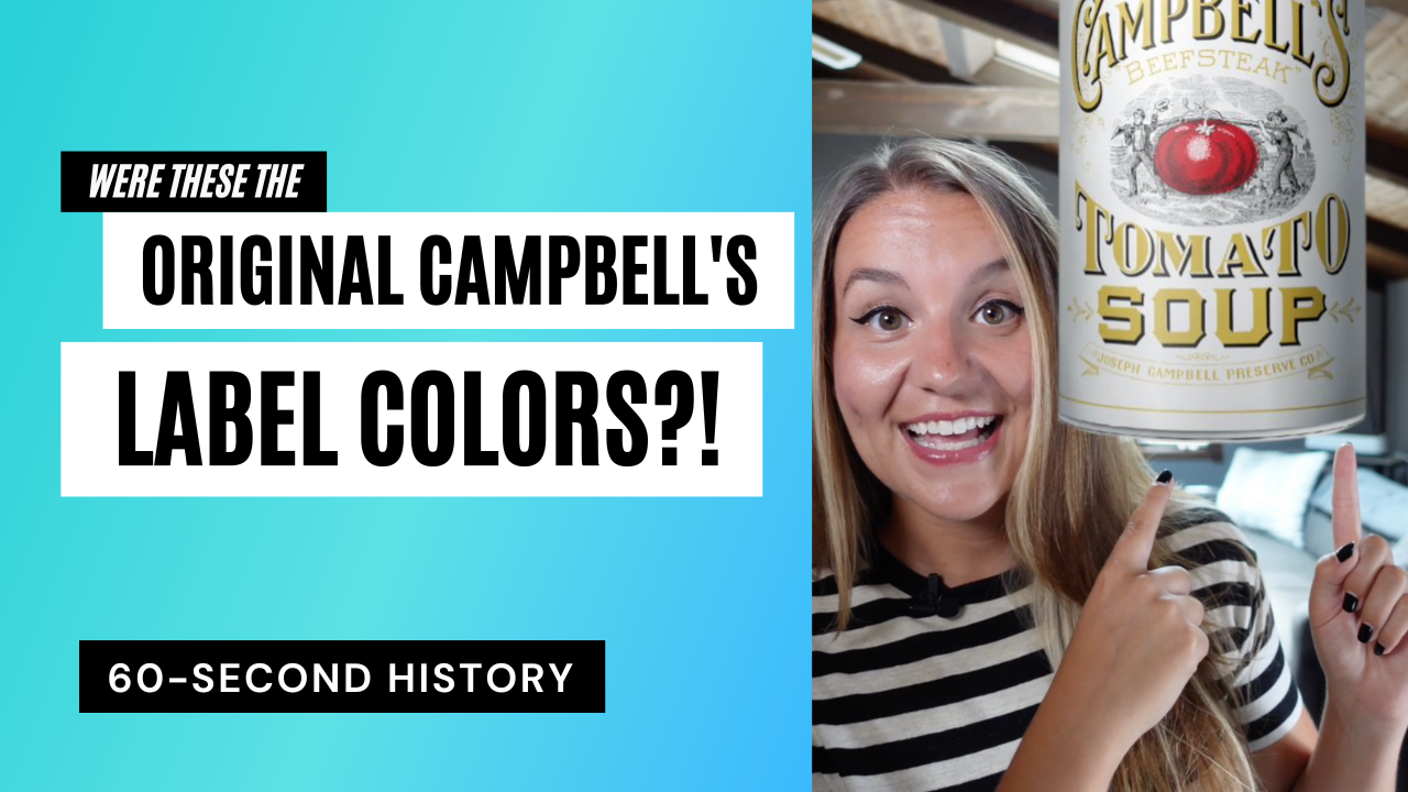
    What was the original color scheme? It was white and gold!

    But wait, there’s more!

    The next design, from 1897 was even weirder. It was blue and orange!

    The label’s design was changed yet again a year later, in 1898, when Herberton Williams, a Campbell’s executive, convinced the company to adopt a carnelian red and bright white.

    He had recently attended a U of Penn vs. Cornell football game and loved how dynamic and easily identifiable the red-and-white uniform of Cornell was to spot.

    In addition to the striking red and white color scheme, the company has also kept the metallic bronze medal seal from the 1900 Paris Exposition where the company won an award for excellence.

    The only thing that’s changed, however, is that instead of saying “Exposition-Universelle-Internationale,” the seal reads “Paris International Exposition.”


  • This Chicago Building is Covered in 24k Gold?!

    Did you know that there’s a building in Chicago that’s covered in 24k gold? Yes, dahling, it’s true!

    The Carbide & Carbon building was created by the Burnham Brothers in 1929. And, yes, before you ask, their dad was famed Chicago architect, Daniel Burnham.

    Imitation gold leaf was originally considered for this 37-story Art Deco structure, but was ultimately rejected in favor of real gold because why the hell not?

    But don’t grab your ladder just yet! Even though this is 24k gold, it’s only 1 five-thousandths of an inch thick.

    Legend has it that this building was created to look like a bottle of champagne, though, this might just be a critique on the excesses of the 1920s.

    Now, not only is this building unique because it’s literally covered in gold, but it also reflects 2 major events in the history of the Chicago Loop:

    • First is the addition of the Michigan Ave. bridge in 1920 that extended the formerly part-industrial, part-residential area of River North with the commercial and retail-saturated area of the Loop.
    • The Carbide & Carbon building also reflects the 1923 zoning ordinance that aimed at providing more light in buildings at street level.

    Also of note is that this was one of the last grand buildings created in Chicago before the Great Depression.

    There were even plans to actually build a sister building to this structure, but with the market crash of 1929, these plans were scrapped real quick.

    Tata! 🙂


  • Salvador Dalí Made a Cookbook?!

    Salvador Dalí Made a Cookbook?!

    Did you know that Salvador Dalí made a cookbook?

    Dalí claimed that he wanted to be a cook when he was 6 years old. He fulfilled that dream in 1973 with the publication of “Les Dîners de Gala,” a surrealist cookbook that feels more like a work of art than a cookbook. I’ll be recreating some of the recipes in here, so stay tuned! 👩‍🍳


  • How to Look at Art – The Interpretative Analysis

    This is part 3 of “How to Look at Art.” In this post, I’m gonna teach you how to do interpretative analysis.

    So, you’ve gazed at the artwork for a long time (maybe a scary amount of long time), you’ve read a couple books and done some research, you know the gist of the artwork, so what’s next?

    Well, now we want to know what’s so significant about this artwork. This leads us to our final mode of analysis: interpretative.

    This is, basically, just a fancy word to ask, “how do we interpret this piece?” This is when you can start bringing in philosophy and critical theory and things like that.

    Some questions you can ask yourself when going through an interpretative analysis are:

    • What is the artist trying to say in this work?
    • What is the person who commissioned this piece trying to say about themselves?
    • What does this artwork say about the human condition at the time it was made?
    • What does this artwork say about the location, people, culture, locate, etc.?

    This is when theories regarding all the -isms come into play and then you really get to engage with this piece of work.

    Tata! 🙂


  • How to Look at Art – The Contextual Analysis

    This is Part 2 of my “How to Look at Art” series. I’m introducing you to the second part of how to look at art, contextual analysis.

    So, what is a contextual analysis?

    This is the part of the process where you’re going to have to do a little bit of research to try to figure out what the hell does this piece even mean.

    Some questions you can use to start off with your research are:

    • What time period is it from?
    • What date was it created?
    • Who’s the artist?
    • What culture did the piece or artist come from?
    • Where’s the artwork now?
    • Who commissioned the piece?
    • What’s being depicted?
    • What’s the provenance of the piece?

    Lots and lots of questions!

    There are so many different questions here that you can ask in the contextual analysis, but once you start with a few different ones, they will lead you into what you need to know.

    At the end of the day, the contextual analysis is just to help you further understand the piece and it’ll lead into the 3rd part of analysis: the interpretative analysis.

    Tata! 🙂


  • What Does the Chicago Theatre have to do with Walt Disney?!

    Hey everybody, Amara here! What does the historic Chicago Theatre have to do with Walt Disney?

    The theatre was built in 1921 by noted architecture duo, Rapp & Rapp.

    With the increasing popularity of film throughout the 1920s, movie theater architecture was evolving rapidly, and Rapp & Rapp were the most sought-out architects for movie palaces.

    They designed many notable theaters throughout the city of Chicago including the Tivoli, Oriental, and Uptown theatres!

    And they didn’t just stay in Chicago! Throughout their career, they designed over 400 theatres throughout the country!

    When it was built, The Chicago Theatre was one of the largest movie palaces in the country boasting a nearly 4,000-seat theater.

    Something to know about movie palaces at this time is that a lot of them had different decorative theming. A lot of these were really harmful orientalist depictions of different cultures. The Chicago Theatre, though, was decorated in a French style.

    The arch on the front of the building was based on the Arc de Triomphe. The Grand Lobby was modeled after J.H. Mansart’s chapel at Versailles. The Grand Staircase is modelled after that of the Paris Opera House, and there were also Louis XIV furnishings throughout the theater!

    The interior lobby even included large French-themed murals created by Chicago artist Louis Grell.

    Now, get this, Grell allegedly taught Walt Disney when he attended school here in Chicago, but that’s a story for another time.

    Also, fun fact, the “Y” that is in the center of the marquee? That is actually the official logo for the city of Chicago. I have a full post on that on my blog, so go check it out!

    Tata! 🙂


  • How to Look at Art – The Formal Analysis

    This is part 1 of “How to Look at Art.” In the field of art history, there is a generally agreed upon system of “looking” at art. In this post, I’m introducing you to the first part: formal analysis.

    So, what is a formal analysis?

    A formal analysis normally consists of looking at the physical characteristics of an artwork. And this isn’t just relegated to painting. It’s typically for all artwork!

    Some things to consider when you’re performing a formal analysis are:

    • Line
    • Shape
    • Texture
    • Medium Scale
    • Figurative or non-figurative
    • Color

    A formal analysis matters! It matters because by identifying specific figures, places, mediums, colors, subject matters, etc., this will help you understand the context which will help you further understand this piece.

    Wanna strengthen your formal analysis chops? I have an exercise for you! Stare at an artwork for 30 seconds. Now, write down everything you noticed. Next, stare at that same piece for 2 minutes now. Did you notice a lot more in those 2 minutes?

    Let me know your results in the comments below! Tata! 🙂


  • Was the Peace Sign Really based off this Famous Painting?!

    Did you know that the peace sign was possibly influenced by this famous painting?

    The peace sign symbol was created in 1958 by Gerald Holtom for the British nuclear disarmament movement.

    Holtom presented it to the Direct Action Committee on February 21, 1958 where it was “immediately accepted” as the symbol for a march that was to protest atomic weapons.

    The symbol is a super-imposition of the flag semaphore for the characters “N” and “D” to stand for “nuclear disarmament.”

    Holtom, though, has also claimed that he was inspired by the central figure in Francisco de Goya’s painting “The Third of May 1808.”

    He claims to have been so captured by the despair of the central figure that he created the symbol to have arms up.

    Not wanting to suggest despair, though, he allegedly changed it so that the arms pointed down, a symbol of hope.

    It was a very popular symbol and was quickly adopted by many other anti-war movements throughout the 1960s, hence its popularity throughout the ‘60s. 

    Today, the original design for the peace sign is in the Peace Museum in Bradford, England.

    Peace!


  • This is the Most Charming Building in Chicago!

    It’s a bird, it’s a plane, it’s a…giant car?! 🚗

    This, my dear friends, is a parking garage located at 60 E. Lake St. in Chicago. But this isn’t just any ol’ parking garage. It’s a car!

    *beep beep*

    Built in 1986 by noted architect Stanley Tigerman, this 12-story parking garage was designed to look like an old car.

    The façade of this postmodernist structure consists of turquoise baked enamel panels. What’s so special about these? Well, this particular color of turquoise was actually sourced from a 1957 Chevrolet color chart. Neat!

    There are two awnings on either side that are painted to look like tires, and two arclights at the top to look like headlights!

    There’s even a little figure on top of the structure to resemble a hood ornament.

    When it was originally built, there was also a “SELFPARK” sign in the middle to look like a license plate, but that’s long gone.

    Have you ever noticed this building in the Chicago Loop before? Let me know in the comments below! Tata! 🙂


  • A Brief History of the Bookwheel

    A Brief History of the Bookwheel

    Is this contraption the 17th century equivalent of having multiple tabs open?!

    What’s the 17th century equivalent to having multiple tabs open at once? This do-hickey! Isn’t it cool?!

    This contraption right here is ye olde book lover’s dream machine. I feel like that’d be a good band name.