• Have You Heard *This* Myth About Victorians and Sexuality?!

    So most of us have probably heard the old story of how people during the Victorian era were so sexually repressed that they even covered the legs of their furniture, but that’s actually a fake story!

    This myth was started by 19th century English writer and British Navy Captain, Frederick Marryat. Marryat authored many books throughout his life, including popular sea adventure stories.

    In his book, Diary in America: With Remarks On Its Institutions, published in 1839, Marryat recounts his experiences in the young U.S. In this book, he wrote about two peculiar interactions he had while visiting America.

    The first incident stems from an anecdote where a young woman that Marryat was traveling with scraped her knee.

    He later asked if her “leg” was okay and apparently she found this so invasive that she replied that a gentleman only refers to “limbs” in the presence of a lady and never a “leg.”

    The second instance further pushes this idea of puritanical purity to a whole new level.

    While escorting a lady to a girls’ seminary, Marryat entered the reception room and noticed that the headmistress had done something weird with the pianoforte. He stated “…she had dressed all these four limbs in modest little trousers, with frills at the bottom of them!” 

    When he asked the headmistress why they were covered, she allegedly claimed it was to “preserve in their utmost purity the ideas of the young ladies” under her charge.

    Now, Victorians did cover their furniture with little do-dids like this, but only to protect the furniture from wear and tear, and not to keep young girls from being seduced by wily pianos.

    But that didn’t matter, this anecdote caught on like wildfire.

    The British press at the time picked up Marryat’s story and ran with it, suggesting that American society was puritanical and had ridiculously fastidious manners. 

    This myth was further propagated by 20th century writers as a shorthand for Victorian repression, but the story backfired and started to reference British sexual repression rather than American.


  • Does the Phrase “Slip a Mickey” Come From Chicago? 🥃

    Did you know that the term “slip them a mickey” may have come from Chicago?

    There once was a man named Mickey Finn who, alongside his wife, Kate, opened a bar on S. State Street called the “Lone Star Saloon and Palm Garden Restaurant” in 1896.

    It was located in a portion of Chicago called Whiskey Row, which was a pretty rough and tumble neighborhood in its heyday. His place was located on the west side of State St., between Harrison and Congress, at the southern end of Whiskey row near Harrison.

    At this very saloon, Mickey ran a school for young pickpockets. The “Garden” of the Palm Garden was a robbing den where his students would pick the pockets of drunkards at the bar.

    Mickey, wanting to increase his odds of being able to rob his patrons, created a signature drink called the “Mickey Finn Special.”

    The Mickey Finn Special was a special drink consisting of alcohol, Tabasco, snuff-soaked water, and chloral hydrate, a white liquid that would knock the drinker out in seconds.

    Women who were paid to flirt with men at the Saloon were instructed to encourage men to order the “Mickey Finn Special.”

    Once the “Mickey Finn Special” knocked them out, Mickey and his men would drag the unconscious man into a backroom, strip them of their clothes and money, and then throw them into the back alley.

    The person would wake up not knowing what would have happened.

    While the Chicago police closed Mickey’s saloon on December 16, 1903, the term “Slip them a Mickey” is still used today!


  • Was This Woman the Most Popular Person in Chicago History?!

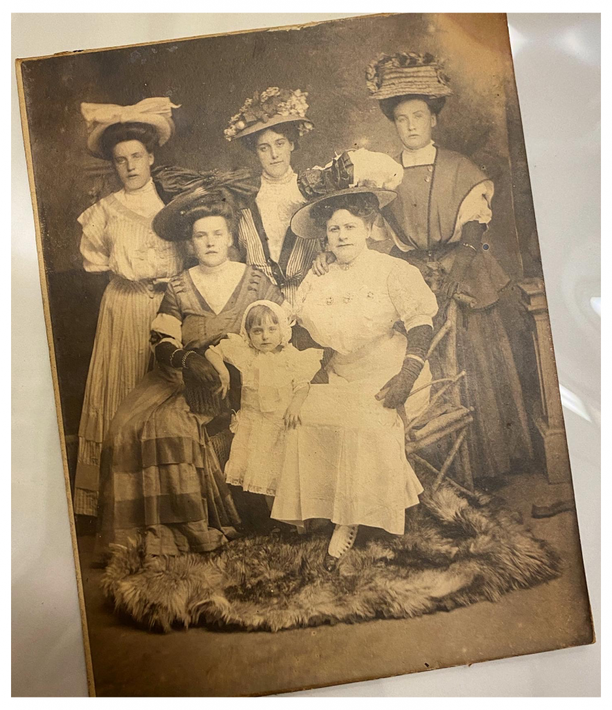
    In this photo, the seated woman in white was one of the most well-known women in late 19th-century Chicago…but not for the reason you might think.

    Vic Shaw, born Emma Elizabeth Fitzgerald,  was the Madam of one of the most popular brothels in the Levee District in Chicago. The Levee district was located between Clark, State, 20th, and Cermak.

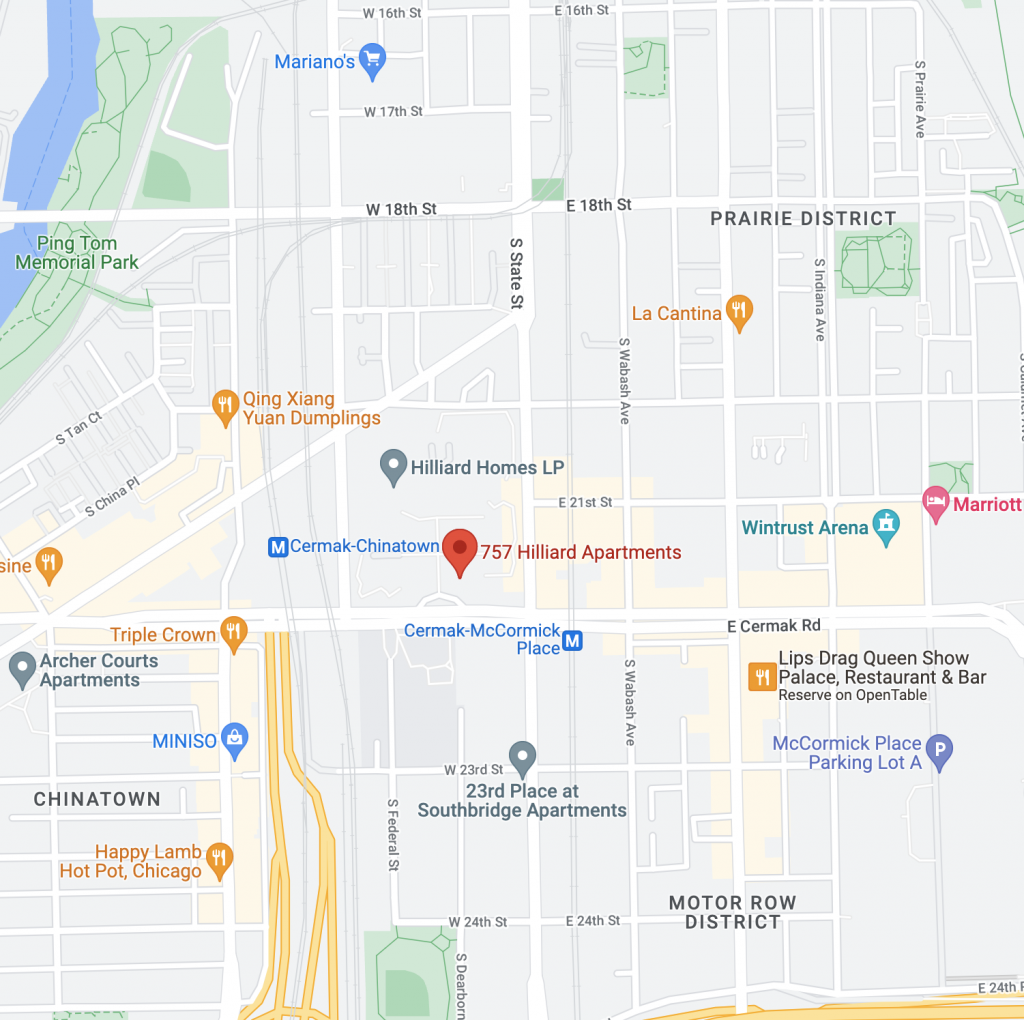
    Her “resort” was situated on Dearborn between Cullerton and 21st Street, where the Hilliard Apartments currently stand. This is the approximate location.

    The approximate location of where Vic Shaw’s brothel used to be.

    While she had fierce competition in the form of the Everleigh Sisters’ Club, Shaw’s brothel was successful until the Levee District was shut down in 1912 by the Chicago Vice Commission. After the Levee closed, Madame Shaw opened another brothel on South Michigan Ave. in a mansion that reportedly had belonged to the Armour family, a prominent Chicago meatpacking family.

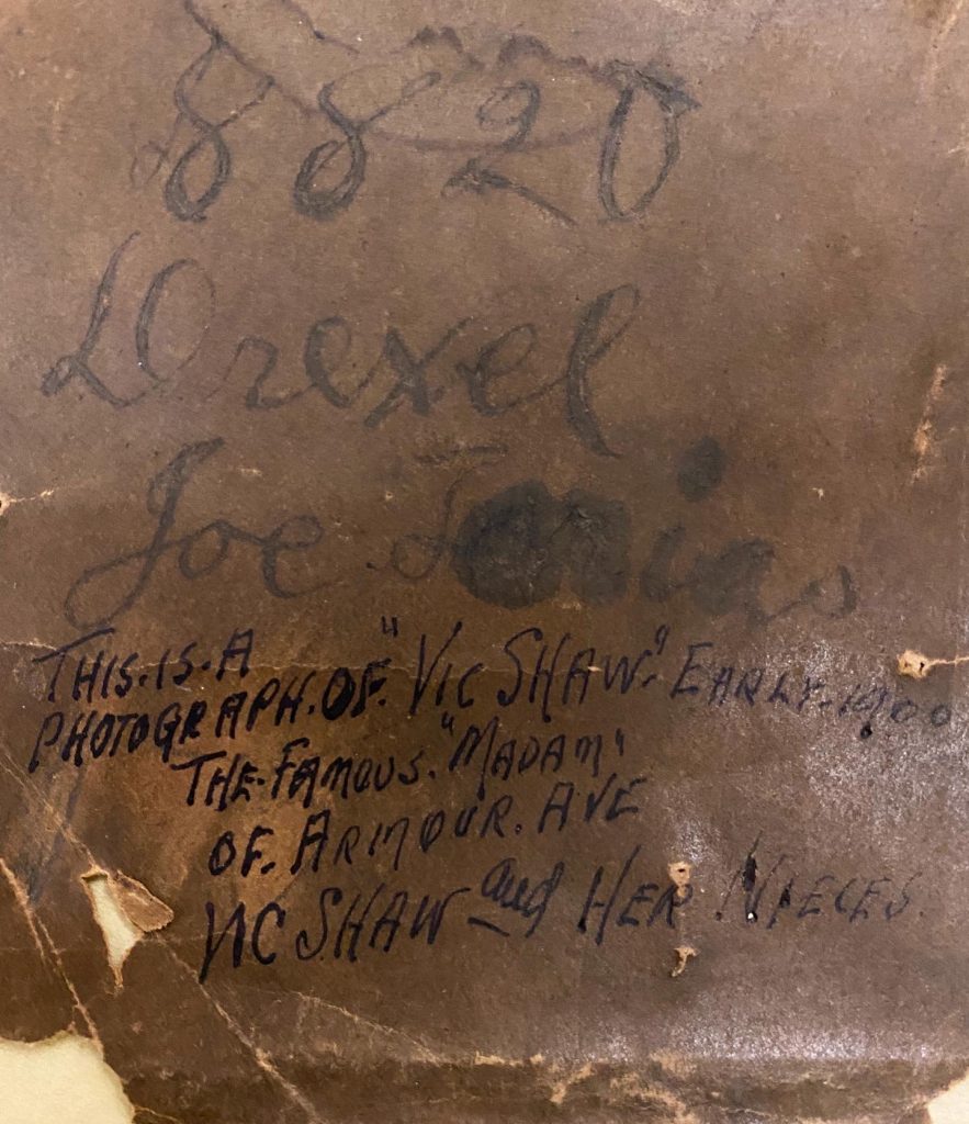
    The above photo is of Vic Shaw and her “nieces” and was taken in the early 1900s.


  • What Were the Original Campbell’s Soup Can Colors?! 🍲

    What were the original colors for the Campbell’s soup can label?

    In 1869, fruit merchant Joseph A. Campbell teamed up with Abraham Anderson, an icebox manufacturer, to create a canned food company.

    They originally produced a wide variety of items including canned tomatoes, veggies, jellies, soups, condiments, and minced meats.

    Anderson, who was a tinsmith, suggested that the original cans be made from tin.

    In 1876, Anderson left the partnership, and the company became the “Joseph A. Campbell Preserve Company.”

    Even though Anderson left, his son stayed at the company and worked as the creative director, designing the original Campbell’s Soup Cans.

    What was the original color scheme? It was white and gold!

    But wait, there’s more!

    The next design, from 1897 was even weirder. It was blue and orange!

    The label’s design was changed yet again a year later, in 1898, when Herberton Williams, a Campbell’s executive, convinced the company to adopt a carnelian red and bright white.

    He had recently attended a U of Penn vs. Cornell football game and loved how dynamic and easily identifiable the red-and-white uniform of Cornell was to spot.

    In addition to the striking red and white color scheme, the company has also kept the metallic bronze medal seal from the 1900 Paris Exposition where the company won an award for excellence.

    The only thing that’s changed, however, is that instead of saying “Exposition-Universelle-Internationale,” the seal reads “Paris International Exposition.”


  • This Chicago Building is Covered in 24k Gold?!

    Did you know that there’s a building in Chicago that’s covered in 24k gold? Yes, dahling, it’s true!

    The Carbide & Carbon building was created by the Burnham Brothers in 1929. And, yes, before you ask, their dad was famed Chicago architect, Daniel Burnham.

    Imitation gold leaf was originally considered for this 37-story Art Deco structure, but was ultimately rejected in favor of real gold because why the hell not?

    But don’t grab your ladder just yet! Even though this is 24k gold, it’s only 1 five-thousandths of an inch thick.

    Legend has it that this building was created to look like a bottle of champagne, though, this might just be a critique on the excesses of the 1920s.

    Now, not only is this building unique because it’s literally covered in gold, but it also reflects 2 major events in the history of the Chicago Loop:

    • First is the addition of the Michigan Ave. bridge in 1920 that extended the formerly part-industrial, part-residential area of River North with the commercial and retail-saturated area of the Loop.
    • The Carbide & Carbon building also reflects the 1923 zoning ordinance that aimed at providing more light in buildings at street level.

    Also of note is that this was one of the last grand buildings created in Chicago before the Great Depression.

    There were even plans to actually build a sister building to this structure, but with the market crash of 1929, these plans were scrapped real quick.

    Tata! 🙂


  • Salvador Dalí Made a Cookbook?!

    Salvador Dalí Made a Cookbook?!

    Did you know that Salvador Dalí made a cookbook?

    Dalí claimed that he wanted to be a cook when he was 6 years old. He fulfilled that dream in 1973 with the publication of “Les Dîners de Gala,” a surrealist cookbook that feels more like a work of art than a cookbook. I’ll be recreating some of the recipes in here, so stay tuned! 👩‍🍳


  • How to Look at Art – The Interpretative Analysis

    This is part 3 of “How to Look at Art.” In this post, I’m gonna teach you how to do interpretative analysis.

    So, you’ve gazed at the artwork for a long time (maybe a scary amount of long time), you’ve read a couple books and done some research, you know the gist of the artwork, so what’s next?

    Well, now we want to know what’s so significant about this artwork. This leads us to our final mode of analysis: interpretative.

    This is, basically, just a fancy word to ask, “how do we interpret this piece?” This is when you can start bringing in philosophy and critical theory and things like that.

    Some questions you can ask yourself when going through an interpretative analysis are:

    • What is the artist trying to say in this work?
    • What is the person who commissioned this piece trying to say about themselves?
    • What does this artwork say about the human condition at the time it was made?
    • What does this artwork say about the location, people, culture, locate, etc.?

    This is when theories regarding all the -isms come into play and then you really get to engage with this piece of work.

    Tata! 🙂


  • How to Look at Art – The Contextual Analysis

    This is Part 2 of my “How to Look at Art” series. I’m introducing you to the second part of how to look at art, contextual analysis.

    So, what is a contextual analysis?

    This is the part of the process where you’re going to have to do a little bit of research to try to figure out what the hell does this piece even mean.

    Some questions you can use to start off with your research are:

    • What time period is it from?
    • What date was it created?
    • Who’s the artist?
    • What culture did the piece or artist come from?
    • Where’s the artwork now?
    • Who commissioned the piece?
    • What’s being depicted?
    • What’s the provenance of the piece?

    Lots and lots of questions!

    There are so many different questions here that you can ask in the contextual analysis, but once you start with a few different ones, they will lead you into what you need to know.

    At the end of the day, the contextual analysis is just to help you further understand the piece and it’ll lead into the 3rd part of analysis: the interpretative analysis.

    Tata! 🙂


  • What Does the Chicago Theatre have to do with Walt Disney?!

    Hey everybody, Amara here! What does the historic Chicago Theatre have to do with Walt Disney?

    The theatre was built in 1921 by noted architecture duo, Rapp & Rapp.

    With the increasing popularity of film throughout the 1920s, movie theater architecture was evolving rapidly, and Rapp & Rapp were the most sought-out architects for movie palaces.

    They designed many notable theaters throughout the city of Chicago including the Tivoli, Oriental, and Uptown theatres!

    And they didn’t just stay in Chicago! Throughout their career, they designed over 400 theatres throughout the country!

    When it was built, The Chicago Theatre was one of the largest movie palaces in the country boasting a nearly 4,000-seat theater.

    Something to know about movie palaces at this time is that a lot of them had different decorative theming. A lot of these were really harmful orientalist depictions of different cultures. The Chicago Theatre, though, was decorated in a French style.

    The arch on the front of the building was based on the Arc de Triomphe. The Grand Lobby was modeled after J.H. Mansart’s chapel at Versailles. The Grand Staircase is modelled after that of the Paris Opera House, and there were also Louis XIV furnishings throughout the theater!

    The interior lobby even included large French-themed murals created by Chicago artist Louis Grell.

    Now, get this, Grell allegedly taught Walt Disney when he attended school here in Chicago, but that’s a story for another time.

    Also, fun fact, the “Y” that is in the center of the marquee? That is actually the official logo for the city of Chicago. I have a full post on that on my blog, so go check it out!

    Tata! 🙂


  • How to Look at Art – The Formal Analysis

    This is part 1 of “How to Look at Art.” In the field of art history, there is a generally agreed upon system of “looking” at art. In this post, I’m introducing you to the first part: formal analysis.

    So, what is a formal analysis?

    A formal analysis normally consists of looking at the physical characteristics of an artwork. And this isn’t just relegated to painting. It’s typically for all artwork!

    Some things to consider when you’re performing a formal analysis are:

    • Line
    • Shape
    • Texture
    • Medium Scale
    • Figurative or non-figurative
    • Color

    A formal analysis matters! It matters because by identifying specific figures, places, mediums, colors, subject matters, etc., this will help you understand the context which will help you further understand this piece.

    Wanna strengthen your formal analysis chops? I have an exercise for you! Stare at an artwork for 30 seconds. Now, write down everything you noticed. Next, stare at that same piece for 2 minutes now. Did you notice a lot more in those 2 minutes?

    Let me know your results in the comments below! Tata! 🙂